Create Beautiful Maps with Python
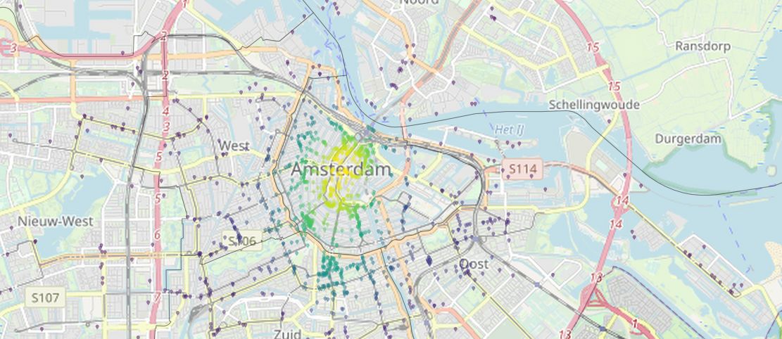
This tutorial teaches you how to plot map data on a background map of OpenStreetMap using Python. So far, I have most often used QGIS or R for my mapping needs, but since I spend around 99% of my programming time with Python, I was wondering if there is a simple way to create good looking maps through Python. As a data source, we use points of interest (POI) information about the city of Amsterdam. Specifically, we want to plot the restaurants and their spatial density on a map. We also use a polygon-shape file of the city to remove any points that lie outside the city borders. The results of this tutorial should look like the following images:
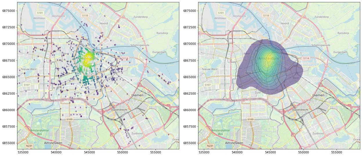
Table of Contents
- Table of Contents
- Installation
- Importing packages
- Loading and preprocessing the data
- Add a background map to the plot
- Show a KDE plot of the spatial distribution
- Color the markers with the KDE information
- Use more specific symbols as map markers
Installation
This tutorial requires the installation of multiple packages; a few of them are not installable for Windows under PyPI. You can start by cloning the GitHub repo for this tutorial:
git clone https://github.com/InformationSystemsFreiburg/map_creation_amsterdam_python
The following packages you need to install as wheels. You find them in the package_wheels_windows folder:
FionaGDAL
Rtree
Shapely
can be installed as wheels with this code:
pip install .\package_wheels_windows\Fiona-1.8.9-cp37-cp37m-win_amd64.whl
pip install .\package_wheels_windows\GDAL-3.0.1-cp37-cp37m-win_amd64.whl
pip install .\package_wheels_windows\Rtree-0.8.3-cp37-cp37m-win_amd64.whl
pip install .\package_wheels_windows\Shapely-1.6.4.post2-cp37-cp37m-win_amd64.whl
After that, the rest of the packages should be easily installable by using the provided requirements.txt file:
pip install -r requirements.txt
Importing packages
We need to import quite a few packages before we can start:
import numpy as np
import pandas as pd
import geopandas as gpd
from scipy.stats import gaussian_kde
import matplotlib.pyplot as plt
from matplotlib.font_manager import FontProperties
from matplotlib.path import Path
from matplotlib.textpath import TextToPath
import tilemapbase
import warnings
import matplotlib.cbook
warnings.filterwarnings("ignore", category=matplotlib.cbook.mplDeprecation)

import seaborn as sns
import shapely.speedups
shapely.speedups.enable()
Download the following data and extract it into the ./data folder of this project:
You also have to unzip the noord-holland-latest-free.shp.zip.
Loading and preprocessing the data
Load the POI data. For the plotting package tilemapbase our data needs to be in the coordinate reference system (CRS) EPSG:3857, therefore we have to convert our location data accordingly.
points = gpd.read_file("./data/gis_osm_pois_free_1.shp")
points = points.to_crs("EPSG:3857")
Filter the data for restaurants (or any other POI category):
points = points[points["fclass"] == "restaurant"]
take a quick look into the data
print(points)
| osm_id | code | fclass | name | geometry | |
|---|---|---|---|---|---|
| 92 | 30839687 | 2301 | restaurant | de Eethoek | POINT (521775.259 6910003.671) |
| 144 | 34043796 | 2301 | restaurant | Sizzling Wok | POINT (550760.350 6853264.008) |
| … | … | … | … | … | … |
| 37100 | 7126562155 | 2301 | restaurant | Duinberk | POINT (522497.422 6928134.759) |
| 37111 | 7137254485 | 2301 | restaurant | Vleesch noch Visch | POINT (542280.944 6869060.363) |
Looks good so far! Now to load the shapefile for the city of Amsterdam in a similar manner as before:
city = gpd.read_file("./data/geojson.json")
city = city.to_crs("EPSG:3857")
take a quick look into this data as well
print(city)
| Stadsdeel_code | Stadsdeel | Opp_m2 | geometry | |
|---|---|---|---|---|
| 0 | A | Centrum | 8043500 | POLYGON ((549136.599 6867376.523, 549133.148 6… |
| 1 | B | Westpoort | 28991600 | POLYGON ((543892.115 6872660.218, 543540.457 6… |
| 2 | E | West | 10629900 | POLYGON ((544918.815 6870710.847, 544873.285 6… |
| 3 | F | Nieuw-West | 38015500 | POLYGON ((539955.524 6866252.019, 539951.183 6… |
| 4 | K | Zuid | 17274000 | POLYGON ((547134.629 6862225.476, 547129.731 6… |
| 5 | M | Oost | 30594900 | POLYGON ((560946.039 6864490.649, 560918.543 6… |
| 6 | N | Noord | 63828800 | POLYGON ((565410.507 6870704.099, 564865.041 6… |
| 7 | T | Zuidoost | 22113700 | POLYGON ((558996.500 6854997.221, 558987.372 6… |
This data looks fine as well! Now we need to remove any points that lie outside the city boarders. For this, we perform a spatial join between the points and polygons and filter out any points that did not match with the polygons. After the join, we drop any points that have not gained an ìndex from the polygons, which means the specific points lie outside the city boarders:
points = gpd.sjoin(points, city, how="left")
points = points.dropna(subset=["index_right"])
With spatial data we always have the luxuary to plot the data tosee if our preprocessing is done correctly:
# edit the figure size however you need to

plt.figure(num=None, figsize=(10,10), dpi=80, facecolor='w', edgecolor='k')

# create plot and axes

fig = plt.plot()
ax1 = plt.axes()

# these values can be changed as needed, the markers are LaTeX symbols

city.plot(ax=ax1, alpha=0.1, edgecolor="black", facecolor="white")
points.plot(ax=ax1, alpha = 0.1, color="red", marker='$\\bigtriangledown$',)
ax1.figure.savefig('./data/plot1.png', bbox_inches='tight')
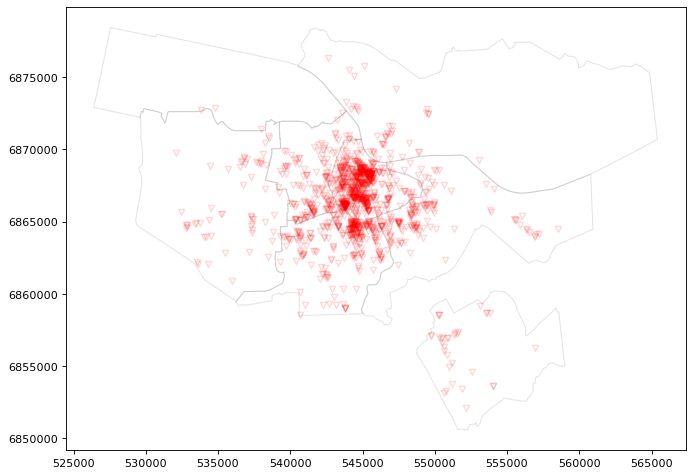
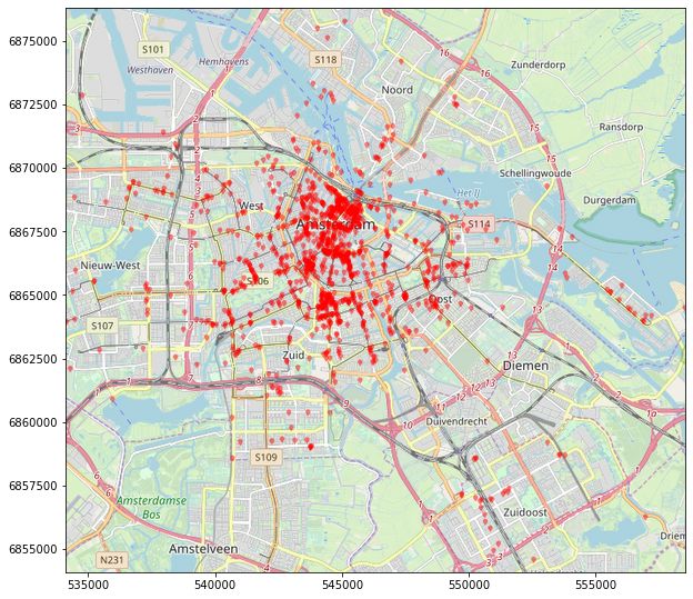
The data seems has been joined as expected! But this map still looks quite ugly, so we should improve it by adding a base map.
Add a background map to the plot
To get a nice background map, we need to find out all the boundaries of our data and save that for later plotting
bounding_box = [points["geometry"].x.min(), points["geometry"].x.max(), points["geometry"].y.min(), points["geometry"].y.max()]
load the background map using tilemapbase
tilemapbase.start_logging()
tilemapbase.init(create=True)
extent = tilemapbase.extent_from_frame(city, buffer = 25)
OK, now we can continue with the plotting. We need to set the limits of the axes according to the bounding boxes. For zooming, we can either add or subtract frrom the first values in set_xlim and set_ylim.
fig, ax = plt.subplots(figsize=(10,10))
plotter = tilemapbase.Plotter(extent, tilemapbase.tiles.build_OSM(), width=1000)
plotter.plot(ax)
ax.set_xlim(bounding_box[0]+2000, bounding_box[1])
ax.set_ylim(bounding_box[2]+2000, bounding_box[3])
city.plot(ax=ax, alpha=0.3, edgecolor="black", facecolor="white")
points.plot(ax=ax, alpha = 0.4, color="red", marker='$\\bigtriangledown$',)
ax.figure.savefig('./data/plot1.png', bbox_inches='tight')
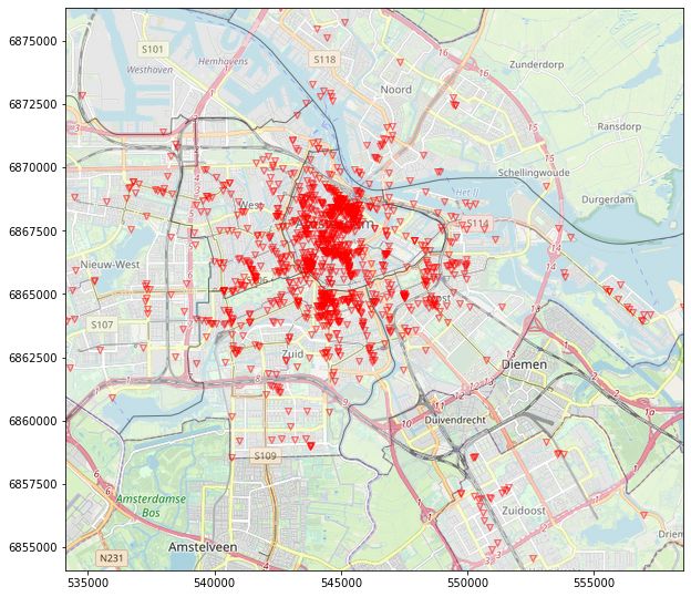
The map looks great! We want to show the data in a few different kinds of plots, but since most code will be reused, we might as well create a small function:
def plot_map(fig, ax, points_plot, polygons_plot, file_name):
"""A short helper function that takes points and polygons as input and creates a plot with a basemap."""
plotter = tilemapbase.Plotter(extent, tilemapbase.tiles.build_OSM(), width=1000)
plotter.plot(ax)
ax.set_xlim(bounding_box[0]+2000, bounding_box[1])
ax.set_ylim(bounding_box[2]+2000, bounding_box[3])
polygons_plot
points_plot
ax.figure.savefig(f'./data/{file_name}.png', bbox_inches='tight')
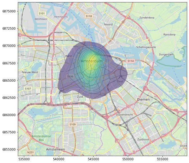
Show a KDE plot of the spatial distribution
If we want to get an impression on the spatial distribution, a KDE plot might help. For this, we use the kdeplot-function from seaborn.
fig, ax = plt.subplots(figsize=(10,10))
density_plot = sns.kdeplot(
                points["geometry"].x,
                points["geometry"].y,
                shade=True,
                alpha=0.5,
                cmap="viridis",
                shade_lowest=False,
                zorder=3
                )
plot_map(fig, ax, density_plot, city_boarders, "plot3")
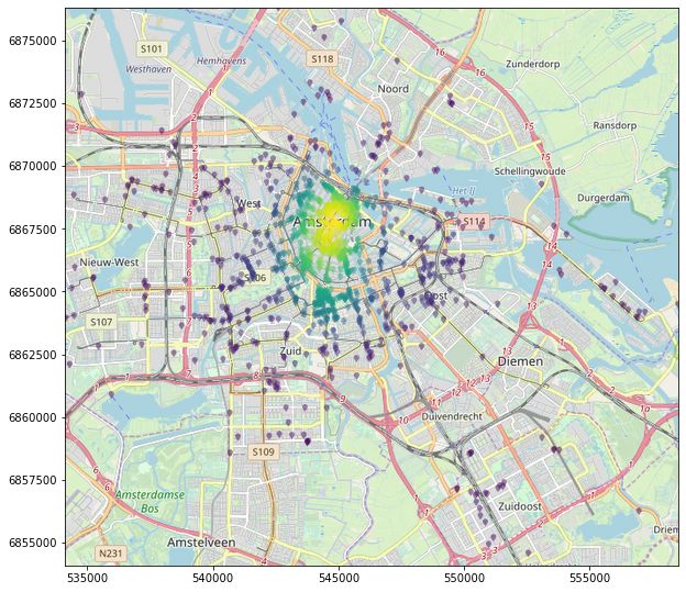
Color the markers with the KDE information
Instead of drawing the KDE as a single shape, we can also color our points according to the density. For this we calculate the gaussian KDE separately and use the result as z-values for our plot. The markers can be changed to ones liking, for this case I settled with simple points:
xy = np.vstack([points["geometry"].x,points["geometry"].y])
z = gaussian_kde(xy)(xy)
fig, ax = plt.subplots(figsize=(10,10))
points_density = ax.scatter(
                    points["geometry"].x,
                    points["geometry"].y,
                    c=z,
                    s=20,
                    edgecolor='',
                    alpha=0.7,
                    zorder=3
                    )
plot_map(fig, ax, points_density, city_boarders, "plot4")

Use more specific symbols as map markers
If you want to change the markers in the map to more sophisticated ones, you could also use Font Awesome. Download the font from here and save it to /resources/. Edit the symbols dict to add symbols that might fit your subject, a cheat sheet for the Unicode characters you can find on the fontawesome website. Just add a \u to any of the Unicode characters.
fp = FontProperties(fname=r"./resources/Font Awesome 5 Free-Solid-900.otf")

def get_marker(symbol):
    """Extracts the symbol from the font."""
    v, codes = TextToPath().get_text_path(fp, symbol)
    v = np.array(v)
    mean = np.mean([np.max(v,axis=0), np.min(v, axis=0)], axis=0)
    return Path(v-mean, codes, closed=False)

symbols = dict(map = "\uf041", map_alt = "\uf3c5")
We can now use these markers with the command get_marker(symbols["map"])
fig, ax = plt.subplots(figsize=(10,10))
points_with_markers = ax.scatter(
                        points["geometry"].x,
                        points["geometry"].y,
                        c="red",
                        s=35,
                        zorder=2,
                        edgecolor='',
                        alpha=0.5,
                        marker=get_marker(symbols["map"])
                        )
plot_map(fig, ax, points_with_markers, city_boarders, "plot5")
This looks pretty good! And of course we can also combine the densty from before to make the final map:
fig, ax = plt.subplots(figsize=(10,10))
points_with_markers_density = ax.scatter(
                        points["geometry"].x,
                        points["geometry"].y,
                        c=z,
                        s=45,
                        zorder=2,
                        edgecolor='',
                        alpha=0.5,
                        marker=get_marker(symbols["map"])
                        )
plot_map(fig, ax,points_with_markers_density, city_boarders, "plot6")
With this last map, we conclude this short tutorial into mapping with Python.
If this tutorial was helpful for your research, you can cite it with
@misc{rosenfelderaimaps2020,
  author = {Rosenfelder, Markus},
  title = {Create Beautiful Maps with Python},
  year = {2020},
  publisher = {rosenfelder.ai},
  journal = {rosenfelder.ai},
  howpublished = {\url{https://rosenfelder.ai/create-maps-with-python/}},
}